What are design tokens?
🤠 What are design tokens?
At their core, they are values that are needed to construct (and maintain) a design system. what we call guidelines, represented as data.
What are the best practices?
There are different levels of tokens, a basic heirarchy that should be followed, in order to utilize tokens in a way that is effective. Meaning that we can easily customize and specify tokens to a particular use case.
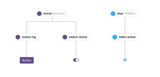
A basic example of the heirarchy is:
global tokens represent a choice → this is the color we chose
alias tokens represent the decision → this is where we have decided to apply that choice to a specific use case.

Why do we need tokens?
The most basic answer is, to make it easily updatable for specific components.
In our case (Brikl), we have a feature known as the theme editor. This is where our merchants can customize parts of their website. An example is to be able to change the color of all buttons, or be able to change the typography used on a Product Card
Let's imagine this scenario 👇

The team decides that they want to change the color of the active state of the radio specifically. whilst its possible to do that at the component level, there isn’t really any context behind it.
Doesnt this mean we kind of already have design tokens?
In this case, not really, because our ‘tokens’ aren’t specific enough, and are applied across multiple components.
This means we are either forced to change the entire brand.primary ’token’, or assign another desired token - for example, content.secondary, but this could result in confusion and miscommunication, as there isn’t any context or reason as to why, as the name content.secondary doesn’t relate to the usage for this specific component.
Let's revisit this scenario again 👌🆗
But this time, let's use tokens properly!

This time, we can change the radio-active token to a different color, without messing up the other components AND provide the proper naming context within the code that this color belongs to the radio in its active state.

How this could apply to our Theme Editor feature?
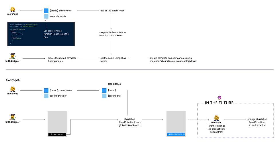
Using this flow, we can see the process of how tokens will work.
1. Merchant will be able to set a brand color and a secondary color.
- This would be on a global level.
2. As a designer, I can set up an alias token called {prodC-button} (a.k.a. Product Card Button)
3. The engineer can now map the global token {brand} to the alias token {prodC-button}
This sets up 2 use cases that will be useful for customization for our merchants:
Use Case 1: Merchant decides to rebrand and change their brand color to pink. The global token can now be set to pink, and every component using the brand color {brand} will change to their new pink color! Easy!
Use Case 2: Merchant wants to customise the Product Card button only. Via our theme editor, they will be able to use the alias token {prodC-button} to change the color of the Product Card button, without interfering with other components.


Some guidelines ✅
-
Use the global tokens sparingly
-
that isn’t to say that we can’t use them, it just means that we better use the specific alias token if applicable
-
-
Always use alias tokens when applicable
-
alias tokens help to associate meaning, context, and/or intent to the design tokens you’re applying to your product, and when the time comes for any changes, it will be clearer for everyone.
-